
BOOKS BY MICHAEL BARRIER
Funnybooks: The Improbable Glories of the Best American Comic Books: Corrections, Clarifications, and Second Thoughts
 I'll expand and refine this list as time
goes by, using it not only to correct errors, including the most
egregious typos, but to add information that was not available when the book went to press, and to address questions that have been raised
since the book was published.
I'll expand and refine this list as time
goes by, using it not only to correct errors, including the most
egregious typos, but to add information that was not available when the book went to press, and to address questions that have been raised
since the book was published.
Page 31: It can be surprisingly difficult to pin down the date when an immigrant became an American citizen, and such was the case with Oskar Lebeck. I didn't locate the critical documents (in the office of the Richmond County clerk on Staten Island in New York City, as it turned out) until a few days too late to cite them in the book. So, for the record: Lebeck was naturalized on February 1, 1935. When he signed the oath of allegiance, it was the only time I know of when he used his full name: Oskar Albert Augustus Lebeck. Otherwise, as when he applied for a Social Security account, he was plain "Oskar Lebeck." He must have disliked those other two names considerably.
Page 37: I write here about Walt Kelly's courtship of his first wife, Helen De Lacy, which culminated in their marriage in September 1937. What's in the book is perfectly accurate as far as it goes, but I found some more details in the Bridgeport Post for September 18, 1937. The Post reported in its Saturday society section that the marriage took place on Friday, September 10, at the First Methodist Church in Hollywood; that's the imposing church you see as you drive north on Highland Avenue, past Hollywood Boulevard and toward Franklin Avenue. The Kellys lived after their marriage at 4319 Price Street in Hollywood, which was their address until they moved back east in 1941. The Post says that the newlyweds were planning to return east in 1937 "at Christmas time to visit their parents, and to attend a preview in New York of a picture on which Mr. Kelly is working now." I don't know which cartoon that might have been. The Post article spells Helen's name as both "DeLacy" and "DeLacey." The spelling I adopted in the book is "De Lacy," which is the spelling she used when she applied for a Social Security account number in 1962.
Page 87: I write of Jack Bradbury on this page: "Bradbury remembered producing three or four stories as a freelancer [when he was animating on the Warner Bros. cartoons] before [Jim] Davis asked him to go into comic books full time." That is what Bradbury told Dave Bennett in 1986, but, in fact, he worked in animation until the end of World War II, not at Warner Bros., but at a small studio called Carey-Weston. At Carey-Weston he continued to animate as well as draw for comic books, but work of the latter kind apparently consumed much more of his time than when he was animating for Friz Freleng at Warners. Late in his life Bradbury wrote about his career, and his association with Davis and the Sangor comic books, in greater detail than in his 1977 interview with Milt Gray or his 1986 interview with Bennett, my two principal sources about Bradbury's career when I was writing Funnybooks. "Excerpts from Jack Bradbury's Autobiography" have been published online and also on pages 37-63 of Volume 16 of Didier Ghez, ed., Walt's People: Talking Disney with the Artists Who Knew Him (2015).
Page 92: The first real error to turn up is a doozy, a compound error in which issue number, date, and story title are all wrong. I write at the bottom of page 92 (and in passing elsewhere) of a Walt Kelly story called "The Laughing Gauchito" that I say appeared in Walt Disney's Comics & Stories No. 23, August 1942, and that I say further was based on a segment planned for the 1942 Disney feature Saludos Amigos but was ultimately scrapped. The comic-book story is actually titled "The Flying Gauchito," and it's in Walt Disney's Comics No. 24, September 1942.
Moreover, although the animated "Flying Gauchito" was originally planned to be part of Saludos Amigos (per J. B. Kaufman's South of the Border with Disney), it was never consigned to the scrap heap but was displaced by "El Gaucho Goofy" and wound up being used in The Three Caballeros instead. The Kelly version thus anticipated the U.S. premiere of the film version not by a few months, as would have been the case if "The Flying Gauchito" appeared in Saludos Amigos, but by more than two years. When Kelly wrote (presumably) and drew an antic comic-book version of The Three Caballeros that was published as Four Color Comic No. 71 in 1945, he revisited "The Flying Gauchito," and the later version is much more assured than the 1942 version, a good measure of how Kelly was ripening as a cartoonist.
Thanks to David Gerstein for spotting my embarrassing goof. When I make such mistakes, I am most troubled when I can't figure out why I made them. In this case, I own the comic books in question, and all I had to do to make sure I had my facts right was pull them off the shelf, so why didn't I do that? Probably this was a "placeholder" error; that is, rather than risk interrupting my rhythm as I wrote, I dropped in facts that I thought were correct, with the intention of checking them later, but I never got around to it. That's always a risk, one I usually try to minimize by, for example, inserting "check" in the passages in question. But not this time, alas.
Page 99: Kim Weston, a renowned Carl Barks scholar, has written in regard to the unsettled question of when Barks began to write as well as draw his ten-page "Donald Duck" stories for Walt Disney's Comics & Stories:
"The second and third paragraphs on page 99 of Funnybooks are very interesting in light of something someone recently pointed me to on the internet. You say Dorothy Strebe may have sent Barks a script for a second 10-pager. But Barks has always claimed he wrote the second 10-pager. I think it is safe to say that he did. But, maybe she did also send him a second script. Barks did very detailed blue pencils of the first two panels of a three-tier 'Donald Duck' page before abandoning the page and presumably the story forever.
"Allegedly this page came to light in one of Barks's later moves, when Bill Grandey and Kathy Morby were managing his affairs. At that time, around 1996, he recalled that it was from 1943, and signed both panels because they were planning to cut up the page so they could sell the panels for more money. Fortunately the buyer stopped that from happening and bought the whole page uncut, so it is still intact.
"Barks might have started drawing the story but quickly found it not to his liking, possibly requiring more work than he felt worthwhile to put the story into good shape, and so he just wrote his own and sent that in. It would be interesting to see if some other story published in early to mid-1943 starts off with a similar premise and that the story was used for another character."
Relatively few Dell comics from 1943-44 are likely candidates as the repository of such a cast-off script, and the likeliest are Looney Tunes and Merrie Melodies Comics and its spin-off titles, Bugs Bunny and Porky Pig. I've checked all those comics, and I've found no stories that look like reworked versions of the story that Barks started but never finished. More detective work is in order, but it seems likely that this story—whoever wrote it, Strebe or Barks—was scrapped completely rather than reworked. As Kim points out, Donald appears to be wearing a striped shirt, and he's also wearing what looks like a baseball cap; is this a uniform of some kind, and was Donald to have been playing baseball, like the characters in the background?
Here is the scan of the two blue-penciled panels, which are now owned by Robert Miller:
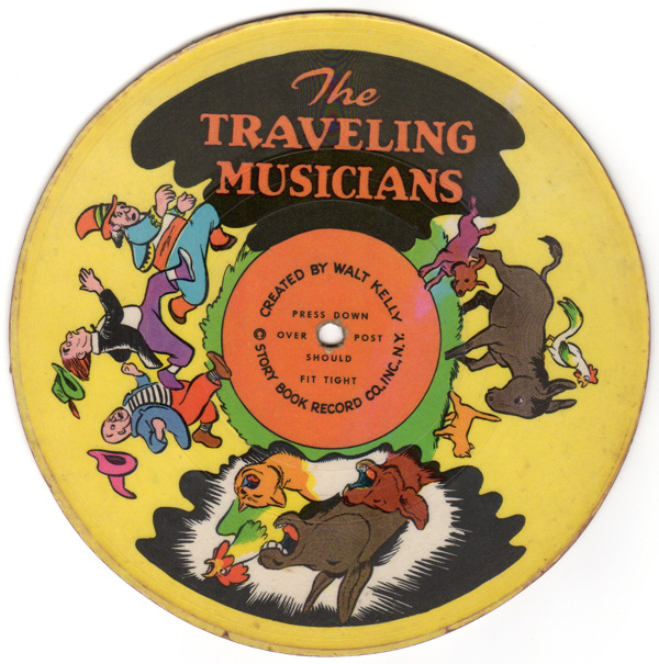
Pages 226-27: I write on these pages about Story Book Records the little 78 rpm children's "picture records" from 1946 with Walt Kelly's rambunctious retellings of sixteen familiar stories (and his drawings on the labels). I own five of the eight records, and digital copies of all of them, but I have been foreclosed from posting any of the records on my website, first by my agreement with the collector from whom I bought my digital copies, and second, where my own records are concerned, by my technical incompetence. I've posted clips from my interviews, but those interviews are on cassette tapes; digital copies of 78 rpm records are beyond me. Happily, Mark Kausler has come to the rescue, by posting two Story Book sides, "The Traveling Musicians" and "The Lion and the Mouse," on his blog. Like all sixteen of the Story Book sides, these two are very brief, only about a minute and a half long, but there's lots of Kelly packed into that short time.
Page 236: Since I completed the book some tantalizing information has come to light about the demise of Li'l Eight Ball, the Lantz character. As I note in the book, Eight Ball lost his stereotypical dialect as of the November 1946 issue of New Funnies; the character disappeared after the August 1947 issue. Oskar Lebeck had written several months earlier to some schoolchildren to tell them that Eight Ball was on the way out, and Walter Lantz himself may have had something to do with Eight Ball's departure, according to correspondence I found in the University of Arkansas's William Grant Still papers.
Still, a distinguished black composer of classical music, was married to Verna Arvey, who interviewed Lantz for a publication called The Criterion (about which I know nothing). He wrote her a thank-you letter on March 29, 1946, telling her: "I am sending your children a subscription of the NEW FUNNIES for one year, and I hope they will enjoy it."
Lantz wrote to Arvey again on November 19, 1946, to thank her for some clippings she sent to him. She had written to him on November 6, evidently remarking on the change just made in Eight Ball's speech. Lantz wrote: "I have just returned from New York and had a meeting with Mr. George Delacorte and Mr. Lebec [sic]. They are quite pleased with the change we have made in the dialogue of the Li'l Eight Ball character, and we feel that dropping the dialect is quite a step forward in the building up of this little character."
Not enough of a step forward to save Eight Ball, obviously, as Lantz may have concluded soon thereafter.
Page 268: I refer here to The Adventures of Peter Wheat as an eighteen-page comic book, but as Michael F. Hodous points out, in all the available issues that Kelly drew, the page count is actually sixteen.
Page 281: George Brenner, Oskar Lebeck's successor as editor of Western's comic books in New York, died not in March 1952, as the book has it, but on September 13, 1952. There's an excellent account of his life and career, including an interview with his son, John, in two posts on Michael Koolman's Quality Companion website. I consulted the book The Quality Companion, by Koolman and Jim Amash (TwoMorrows, 2011) when I was writing Funnybooks, but unfortunately its account of Brenner's life and early death is sketchy, the best that Koolman and Amash could do at the time, and I didn't see Koolman's much more complete web posts until it was too late.
Brenner was evidently an editor for Western no more than a year, maybe less, and I can't recall that any former Western people ever spoke to me about him; likewise, I don't recall ever seeing him mentioned in any published interviews. And yet, he was, in his son's account, a gregarious, cheerful person—a worthy successor, one might think, to Lebeck, especially since, John Brenner says, Brenner liked his new job "a lot." It's tempting to wonder what course the Dell comics might have taken if Brenner had survived.
I don't specify on this page just when Lebeck left the comic strip called Twin Earths. Alden McWilliams, Lebeck's collaborator on Twin Earths, wrote in a May 1957 letter to a fan, Roger Steffens, that "Lebeck is retiring to Florida and wants no further part of writing or anything else resembling work. So the syndicate asked me to try my hand at taking over the writing as well as the art. I've been writing it now since about the time Vana, the Terra agent, approached Perry Pierce to go to Terra."
I haven't yet consulted the comic strip, either on microfilm or in reprints, to establish just when the change occurred. McWilliams told Steffens that Lebeck's name would remain on the strip despite his departure. His letter was published in Twin Earths Special Edition (R. Susor Publications, 1993), p. 23.
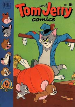 Page 297: I write here that when the page count for Tom and Jerry Comics fell from 52 to 36, "[t]he change came so abruptly that the November 1951 [issue] bore ghostly traces of the '52 pages' slogan in the lower left-hand corner of the front cover." Mark Kausler wrote to tell me that his copy of that issue doesn't have those "ghostly traces," just a blank space, and when I pulled out the copy of that issue that I now own, I was surprised to see that it doesn't have those "ghostly traces," either. Neither did the several scans of the cover I found on the Web, like the one at left. The space that would have been occupied by the slogan is there, but it's blank.
And yet: I have a very strong memory of owning a copy with such a ghost image. I bought it in the early fall of 1951 just as I was starting to collect Dells, after my parents honored my eleventh birthday by lifting the one-a-week ceiling on my comic-book purchases. I owned it for about six years, until I gave away most of my comic books. I was particularly attentive to Dell minutiae like the indicia, the subscription coupons, the cover lettering, all that stuff, to the point of imitating them, pointlessly, in my own hectographed comic book. The ghost image was exactly the kind of thing that I found particularly intriguing.
I began collecting just as Dell was dropping all its titles to 36 pages, and I was alert to the consequences of that shift (like the disappearance or shortening of some features, and the fact that only four of the monthlies—Walt Disney's Comics, Looney Tunes, New Funnies, and The Lone Ranger—survived as 52-pagers through their November issues). So I don’t have the slightest doubt about seeing that ghost image, but it may have been the rough equivalent of a misprinted stamp. I can readily believe that someone at Western saw an early printed copy with the ghost image and ordered the presses halted until the offending lettering could somehow be removed, but the covers already printed were not scrapped. When I was production editor for Nation’s Business magazine, back in the eighties, I often ordered such changes when the magazine was on the press. But now I need to find a copy of that Tom and Jerry Comics with the ghost image. Help!
Page 299: The artist who painted the two King of the Royal Mounted covers described on this page was William George, whose career was the subject of a long interview in Illustration No. 8, October 2003. During his brief affiliation with Western (a year and a half, he says in the interview), George painted covers not just for King but for Sergeant Preston of the Yukon, Red Ryder, The Lone Ranger, and probably others.
Page 326: I write here about the deleterious effects on Carl Barks's artwork, like the elongation of the ducks, when Western began providing him with what he described as a clay-coated drawing paper made in West Germany, in place of the Strathmore drawing paper he had been using. As Michael F. Hodous has pointed out, Barks's accounts seem to be somewhat inconsistent as to how long he had to draw on the clay-coated paper. Establishing a plausible chronology is surprisingly difficult.
In Funnybooks, in regard to the problem paper, I quote from two interviews with Barks, one I recorded in 1974 and another by Donald Ault and Tom Andrae from 1975. Barks also spoke about his paper problems on other occasions, as in an interview with the late Edward Summer for Celestial Arts' deluxe Uncle Scrooge collection. In Carl Barks and the Art of the Comic Book, I quote from a 1960 letter to a fan in which Barks seems to say that he was still drawing on the German paper in that year, and still not liking it. And there's the related question of whether the paper's defects simply accelerated a deterioration that was already under way.
The complicating factors are that there would seem to be nothing to go on except (1) Barks's comments about the effects of the German paper, and (2) what's visible in his stories in the comic books themselves. (That's not exactly true, as evidenced by the information provided by Joakim Gunnarsson below, but let's stick with that starting point for the moment.) I pulled the notes I made during work on Funnybooks, and I find that I first noted the elongation of the ducks in three issues all published in mid-1958: Walt Disney's Comics & Stories No. 215, August 1958; Donald Duck No. 60, July-August 1958; and Uncle Scrooge No. 22, June-August 1958. All of the important stories in those issues were submitted by Barks to Western between August and December 1957. There may have been a tendency toward elongation in earlier issues, but it's in those 1958 issues that the elongation became unmistakable.
Assuming—as I think we can, without pulling a lot of comic books to make absolutely sure—that the short, bouncy ducks were back by 1960, that leaves the question of why Barks wrote in that year as if he were still hogtied by the bad paper. I may have an answer. The letter I quoted in Carl Barks and the Art of the Comic Book was addressed to John Verpoorten on December 1, 1960; Verpoorten had written a few days earlier about the changes in Barks's drawings of the ducks, and Barks replied:
Some writers have wondered about changes in the duck's appearance over the years. Perhaps you, too, have noticed that his beak is shorter and his legs vary in length at times. These changes happen mostly from switching the grade of paper I draw on. In the old days I was furnished the best grade of Strathmore, and my style was more detailed and the characters more expressive. Nowadays (except for a recent temporary period) the paper furnished us artists has been a clay-coated import from Germany. The pencil and pen digs into the surface. The result has been a tightening of the lines, less bounce to the characters. I've griped, but the economy of the cheaper paper wins out in the front office.
I extracted the quotation in Carl Barks and the Art of the Comic Book from that part of the letter to Verpoorten. I also deleted the parenthetical phrase, for reasons I no longer recall but probably because I thought it introduced an unnecessary complication. That phrase is directly relevant to the current discussion, though, because it indicates that at the time he wrote in 1960, Barks was indeed working with that problematic paper.
That raises another question, though: if the German paper was responsible for the elongated ducks of 1957-58, how did Barks circumvent its effects and begin drawing short and bouncy ducks again a couple of years later? Was the lack of complexity in those bouncy ducks partly a result of his response to his drawing paper, and not just a reflection of his more confining working arrangements?
Barks may have provided the answer on page 176 of the Celestial Arts Uncle Scrooge book: "The company that made this new paper was in West Germany. They themselves discovered that the paper was too soft on the surface and started turning out a good product. So all of a sudden my paper was nice and firm again, and I was able to draw like I wanted to."
The chronology remains a little awkward—Barks was still complaining about the paper in 1960, even though by then the most obvious effects he attributed to it, like the elongation of the ducks, had disappeared—but establishing a firm time line, and identifying the stories drawn on the problem paper, awaits more intense study than I expect I'll ever undertake, for reasons Geoff Blum has suggested in correspondence with me and Mike Hodous:
Barks was enough of a workman that, handed a supply of the new claycoat paper and having begun a story on it, then finding the paper unsatisfactory, he might well have turned to the remainder of old stock lying around his house to complete the story without feeling obliged to redraw the pages he had already set down on claycoat. In addition, when he made a trip in from the desert to Western’s office to deliver completed work, he might well have griped in person and been handed yet another supply or a sample (“Oh here, Carl, try this lot that came from the manufacturer last week”). At that rate, a single story could conceivably have ended up on multiple stocks. Carl did revise and cut-and-paste, witness in particular “The Golden River” [in Uncle Scrooge No. 22, June-August 1958], but I believe that was to tighten narrative rather than to redraw claycoat frustrations. If you want to pinpoint what’s clay-drawn and what’s not, you might end up having to parse the stories page by page.
Mike Hodous raises another point: if the German paper was such a nuisance, did others of Western's artists not complain about it, too? I don't know of any who did, but that may be because most of them seem to have worked with brush and ink, rather than pen and ink, like Barks. The problems Barks complained of—his pen digging into the paper's surface, in particular—would not have shown themselves when an artist was working with a brush.
Joakim Gunnarsson has written with insights based on his examination not of original Barks art, but of original comic-book pages drawn by some of Western's other cartoonists at the same time that Barks was using, and complaining about, the German paper.
I pulled out my original "Scamp" pages by [Al] Hubbard from Walt Disney's Comics No. 235, April 1960, to check the paper quality. It was indeed a German paper. The stamp says: Schoeller Durex. So I guess we can assume that this was the actual brand Barks used.
Also checked my Paul Murry "Message in a Nutshell" pages from Walt Disney's Comics No. 380, May 1972. Still Schoeller Durex, but the size of the board is smaller. Both the 1972 and the 1960 versions of the art boards have pre-printed blue lines.
I then compared the 1960 paper to the paper of an unfinished Murry page scheduled for a 1956 Donald Duck issue, and they felt just about the same. But the 1956 page didn't have any pre-printed blue lines and the top half of the page that I have doesn't have the mark in the paper telling me the brand. Might be that they tested the paper in 1955-56 before they ordered sheets with pre-printed blue lines.
I checked my Carl Barks Library sets and to me the odd and longer Donald begins to appear in Walt Disney's Comics No. 198, March 1957. The ducks suddenly are much taller in some panels. The previous story has the bouncy and well proportioned Donald.
The first issue of Uncle Scrooge in which I notice the change is No. 16, December-February 1957, "Back to Long Ago." (Actually, the page where they sneak in to a concert in Uncle Scrooge No. 15 has the same odd proportions. Might that be the first page on the new paper?)
It seems highly likely that Barks was drawing on the same Schoeller Durex paper that Al Hubbard and Paul Murry were using. After sending the above information, Joakim wrote:
I re-examined the 1956 paper and compared it to the 1960 paper, studying it closely and the surface on the 1956 paper is "rougher." So they actually differ. But the weight/thickness feels the same. And I noticed that the 1960 paper has preprinted blue lines on the back. For artists who preferred to draw smaller.
What Joakim found when he examined the original artwork certainly seems to be consistent with what Barks said about the German company's improvements in its unsatifactory paper.
 And there's more. Joakim also wrote:
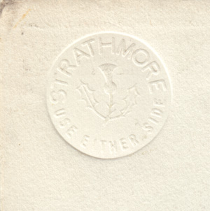
Just remembered that I also have a cut half page intended for for the "Li'l Bad Wolf" story in Walt Disney's Comics No. 137, February 1952, I scanned a piece of that paper and it looks like it could be the same as the paper Murry used for the 1956 page. Meaning that the paper Murry used in 1956 might not be the new German paper but the last stock of the good ol' Strathmore.
The scan of the Strathmore label from that half page is at the right.
As Joakim notes, a few pieces of Barks art have survived from the period in question, the mid- to late 1950s. Barks himself cut and saved panels from "Land Beneath the Ground" (Uncle Scrooge No. 13, March-May 1956) and "The Golden River," and the complete unpublished "Milkman" story from 1957 also survives. So, theoretically at least, it might be possible to compare the paper used for those stories with the paper used for the surviving non-Barks panels and come up with a rough timeline for the changes in the paper and the corresponding changes in how Barks drew the ducks, in particular their elongation..
As a practical matter, though, close examination of the published comic-book stories is likely to be more productive. For my own satisfaction, I'm going to have to pull my Barks comics from 1957-60 sometime soon and give them enough scrutiny to let me determine if I agree with my own notes about when the elongation appeared, or if I agree with Joakim that the elongation appeared earlier. Stay tuned!
And there's something else... As Mike Hodous points out, the ramifications of the Matter of the Disproportionate Ducks extend beyond the interior pages of the comic books, to their covers. Barks himself made the connection. Mike writes:
It's wonderfully fitting to have Joakim on board, because a letter from just about forty-five years ago to one of Joakim's fellow countrymen in Far-away Sweden, as Carl Barks put it in the inside address line, sheds yet another light on the debate regarding the disproportionate ducks. In a private communication to Klas H. Reimers dated March 23, 1971 and reprinted in No. 27 of Gladstone's Carl Barks Library Walt Disney's Comics & Stories color reprints from the 1990s, Barks writes in part: "... Also, I was drawing many covers for the magazines and would get the anatomy of the ducks mixed up in my head. The cover drawings of Donald and the kids had to have very large heads and short legs. Without realizing it I once drew Donald and the other ducks short-legged and big-headed in the story pages for over a year. Then I over-corrected and drew them with small heads and tall bodies for a while. I was at that time drawing a year ahead of publication, so that many comics went out before I saw my work in its reduced printed size. Believe me, the characters' proportions look different in the small size." So, besides rereading 1957-1959 stories looking for tall scrawny ducks, we've got to reread 1956 stories looking for short macrocephalic ducks. The last panel on page one of the story from WDCAS No. 190 (July 1956) certainly fits that description.
We've also got to reread the article(s) on drawing requirements for comic book covers in the 1980s-vintage black-and-white Carl Barks Library. Isn't modern science wonderful?
Mike has since re-read that article and has reported as follows:
The article that I had in mind, "The Art of the Comic Book Cover," by Thomas Andrae and Geoffrey Blum, begins on page 49 of Book 1, Set VIII of the library in question. After two "Continued on page ..." entries, the relevant text appears on page 118.
Barks may have felt diminished interest in the covers not only because he had to use other writers' gags, but because the editors obliged him to draw the ducks out of proportion.
"I think they wanted Donald's head to be a certain percentage of the size of the whole cover," he recalls. "That gave me the most trouble, because it meant that the ducks' heads had to be so much bigger in proportion to their bodies than they were on the drawings inside the book.
"The duck on the truant officer cover [issue 104 (May 1949)] is fairly well in proportion—that was among my earlier ones—but the nephews' heads are much bigger than they are inside the book. On the sailboat cover [108 (September 1949)], the little guys' heads are actually bigger than Donald's. When I did paintings of that cover, I corrected the disparity between the sizes."
Sometimes the need to make Donald's head large forced Barks to shorten the duck's bill. Barks has remarked that the head on the cover of issue 133 [October 1951, above) is "as big as a pumpkin! With the bill a foot long ... why, he would have taken up the whole cover!"
The Barks quotations are footnoted as from an interview with Carl Barks by Bruce Hamilton (questions by Hamilton, Geoffrey Blum and Thomas Andrae), January 8, 1983. More comments on the size of Barks's (and other people's) drawing paper coming up when I've had time to check some more references.
Barks's Walt Disney's Comics covers have always struck me as one of the least interesting corners of his work—Walt Kelly's covers from the 1940s are much more flavorsome—and I've never felt the urge to write much about them. I've been aware for a long time, though, that the ducks' heads were noticeably bigger on some covers of Walt Disney's Comics & Stories—the October 1953 issue comes immediately to mind—and it may be that the distortions imposed on Barks when he was drawing those covers affected his drawings for the interior pages. Definitely a subject for further study!
And for another example of a cover distortion undoubtedly intended to attract the prospective buyer's eye to a Dell comic book's leading character, go to this item I posted in December 2011.
And there's even more... Mike Hodous has explored many of the questions raised by the earlier entries about page 326 in Funnybooks, and he offers these fruits of his research:
First, many, many thanks to Joakim for his detailed information and scans of actual drawing paper from the epoch in question. While I've been speculating, Joakim has been studying. Second, here are the websites of Strathmore and Schoellershammer, the current producers of the types of art paper that Barks and other Western artists were dealing with sixty years ago.
Here is what I could find about Durex paper, smooth and matt, now that Joakim has identified the brand of German drawing paper. Unfortunately for our purposes, none of this includes historical information regarding Durex in the middle and late 1950s and early 1960s.
Third, browsing Mark Evanier's website shows that Barks was not alone. As one very small sample, consider these five paragraphs:
A few columns back, we discussed the fact that comic book companies often supply drawing paper to their artists. This, we noted, is less due to generosity than to a desire not to have quarrels. The general rule of thumb is as follows…
If the penciller picks out the paper, the inker won't like it and if the inker picks out the paper, the penciller won't like it, and even if the penciller and inker agree on a stock, the letterer won't like it.
I mentioned here weeks ago that, when I worked for Jack Kirby, it took us a while to find a paper stock on which he could draw. The pencils he liked to use did not like the paper that DC supplied…but when we bought a kind that worked for Jack, it presented problems galore for Mike Royer, who inked n' lettered the books. Well, I'd forgotten (but Mike has since reminded me) that even the paper stock we ultimately selected wasn't ideal and, in order to do his best work, Mike found it necessary to iron the pages before inking them.
You read that right: Iron them. As in, he took a plain, old-fashioned iron—the same kind your momma used to press your dungarees—and ran it back and forth over all those Kamandi pages.
No, they weren't wrinkled. You don't have to be Bill Nye the Science Guy to figure out the heat did something to the graphite and/or paper, making it more conducive to ink. Mike wore out three or four General Electric irons in the service of the King of the Comics.
Fourth, Barks disliked another trend in the early 1960s that had nothing whatsoever to do with paper surface texture. In a letter to Malcolm Willits dated April 19, 1962, and published in the Gladstone CBL of WDCAS in Color No. 8 (and also excerpted on page 338 of Funnybooks), Barks writes in part:
A change that has gone through, however, is one reducing the drawing size. It is a painful one for us artists, as the old size of 2 and 1/2 times up gave us room to operate with big pens or brushes when advantageous. Now the size is 2 times up. This wouldn't be a calamity, except that some bright boy in the East thought that the pages would look "different" if the dialogue balloons were inset a minimum of 1/4 inch from the top or sides of the panels. Naturally, this compresses the drawing area. I've diagrammed a page to show you the other changes. I think the pages will look different, all right. So different the kids will leave the books lie right on the stands.
Fifth, I may have stumbled across a back door to help investigate changing paper size. Heritage Auctions, either as a public service or as a subtle form of advertising, lists detailed descriptions, including high quality scans, not only of current, but also of previously auctioned items. For example, some Tarzan pages by Jesse Marsh: "This handsome page has a huge image area measuring approximately 15.75" x 23", and the art is in Excellent condition."
If we estimate the actual printed image size of a typical comic book of this era as roughly six by nine inches, then the original artwork is drawn at about two and a half times the published size. Now from thirteen years later, at the beginning of the Gold Key era: "The overall paper measures 14.5" x 21.75", while the image area is approximately 12" x 18". The word balloons are pasted-on art additions; otherwise the art is in Very Good condition." So the image area has shrunk to twice the published size.
The same for Paul Murry: "Ink and graphite on Bristol board, with an image area measuring 16" x 11.5"." "Ink and graphite on Bristol board, with an image area measuring 16" x 11.5"." I'm willing to call these two half pages two and a half times published size.
Now from the Gold Key era: "This thriller has an image area of 12" x 18", and it's in Excellent condition." So here too we're down to twice published size.
And further down the line ..."The art is in ink over blue pencil on two conjoined pieces of Bristol board, joined at the back by masking tape. The combined image area measures 16" x 23.25", and the art is in Excellent condition. Signed by Barks in the lower right corner."
So, despite edicts from some bright boy in the East, Barks was still working at two and a half times published image size toward the end. Every once in a while the right thing happens.
I realized, in reading Mike's report, that in Funnybooks I blur a significant distinction, between the short-lived Gold Key design change (the colored or missing panel borders) and the reduction in the standard image area of the original comics pages, from two and a half times published size to twice published size. The two changes were apparently simultaneous, but they weren't necessarily related, as indicated by the survival of twice-published-size pages long after the design change was scrapped.
As Mike notes, Barks was allowed to go back to working two and a half times published size after, I would guess, a very brief interlude (perhaps encompassing only Uncle Scrooge No. 40) in which he worked twice up. The sole Barks comic-book page on my own walls, the last page of the February 1963 "Donald Duck" story from Walt Disney's Comics, has an image area of roughtly 23 by 16 inches, or two and a half times the published size.
And there's still more to be said about the context in which Barks worked, both at Western Publishing and in the comic-book industry as a whole. Mike Hodous explains, quoting extensively from two leading authorities, Geoff Blum and Mark Evanier:
One member of our Company was thinking ahead twenty or twenty-five years ago. Geoffrey Blum, associate editor of Gladstone´s Carl Barks Library in Color (and of much else besides), writes in the first of eighteen “Letters to the Duck Man” columns published during the fifty-one volume run of the CBLiC WDCAS (No. 4):
Most fans have preserved their letters from Barks, and the artist himself kept a rough file of copies and carbons. In several cases a letter exists in two versions, the pencil draft and the fair copy or final typescript. These double drafts provide an intriguing glimpse into Barks´ epistolary methods, showing him to be as careful a correspondent as he was a storyteller. … In the transcript below, which was made from the final letter, such variant readings and deleted passages from the drafts are provided in italics.
Then, in the third “Letters to the Duck Man” column in CBLiC WDCAS (No. 8), Geoff remarks:
We are fortunate to have two versions of the letter in question, a pencil draft and the final typescript, so we can watch Barks launching his tantrum, toning it down, then spicing it up again as a choice turn of phrase suggests itself. His primary gripe seems to have been the new format imposed by his publishers in 1962, so he cut out a long digression about the freeway system and polished his comments about page layout. … As before, our transcript is from the final letter, with such variant reading and deleted passages provided in italics.
Under discussion is the April 19, 1962, letter to Malcolm Willits. Barks´s paragraph about the new format in the original pencil notes (thanks, Geoff!) reads
The change that gripes me and most other artists on the Western Pub. comics is one that reduces the drawing size from “2½ times up” to 2 times printing size. This wouldn´t have been too hard to adjust to, but at the same time a rule was established affecting shape and position of dialogue balloon, panel arrangement, etc. I´ll diagram a page to show you how “organized” the new format looks.
We can argue about whether this is more disapproving than the final typescript. Please note, though, that in the original pencil notes Barks claimed to speak not only for himself, but also for “most other artists on the Western Pub. comics.” He did the same thing in the first quotation published on page 326 of Funnybooks.
Then they got to buying some West German paper [that] was coated with kind of a clay surface, and it was very difficult to draw on. They got it much cheaper, they´d buy it in trainload lots, I guess. There were so many complaints came in from the artists on the first batch of that stuff, they got this German company to make a better grade.
So, was Barks prone to use the editorial “we” when speaking of problems that he himself encountered? Or did he know more about what was happening to other people than he let on in his December 18, 1966, letter to Michael Barrier as quoted on page 164 of Funnybooks?
There's still far more to come from Mark Evanier´s website on just how industrial the production of nonBarksian comic books often was. For the moment, here´s something from Mark´s Jack Kirby FAQ regarding the paper situation at DC in the 1970s.
What kind of pencil and paper did Jack use?
Pencils were your basic #2 drawing pencil, although he sometimes experimented with softer leads. As for paper, Marvel and DC both supplied paper most of the time. Jack found the Marvel paper easy to draw on and most of the DC paper impossible to draw on. He got into a friendly argument once with Joe Kubert, who loved the DC paper. Kubert told Jack it worked great if you pencilled in blue. Jack said he hated working in blue pencil. Kubert said it took a brush well. Jack said, "I don't ink." And so on. Steve Sherman and I finally bought Jack a kind of two-ply kid-finish Bristol Board that he liked and that was fine until Mike Royer started inking the books, and Mike had enormous problems inking on the paper. So a lot of time was spent trying different kinds before we found one that Jack could pencil on and Mike could ink on…and I don't recall the name of the brand. But this explains why comic book companies usually furnish the paper for their artists to draw on. It cuts down on arguments between pencillers and inkers.
And some more Evanier links where I want to extract a few more of the choicest quotes: On Murphy Anderson (and about inking as a separate production stage). Earlier, from Mark´s Point of View columns back in 1997 the first and the second columns on lettering.
7. Paper Preference. Most comic book companies furnish illustration board to their artists, usually pre-printed with the margins in non-repro blue. This is not a matter of the company being generous — it's to ward off arguments. You see, some paper that is great for penciling is bad for inking and vice-versa. Jack Kirby, for instance, disliked the paper that DC and Marvel furnished, but every time Jack bought his own paper, the inkers complained it didn't take ink well. Letterers frequently have the problem that the chosen paper stock may not be friendly to the specific tools they use. But since computer lettering is not on the actual art board, no one has to worry about their needs. The drawing surface can be selected wholly with regard to what's best for the artist(s).
And, from the same era, the first column and the second column about inking as a separate production stage. Where we note Murphy Anderson´s shift from 12" by 18" drawing size to 10" by 15":
Over the years, the size of the original art has often impacted the design of what was drawn on it. Back in the forties and fifties, many of Western Publishing's funny animal comics (Disney, Looney Tunes, etc.) were drawn so large that most artists couldn't fit an entire page on their drawing tables. Carl Barks, among others, cut the pages in half and would work on one piece, then the other.
This, of course, made it impossible to do a full-page panel or to have a panel cross the center of the page. Later on, Western went down to a more functional size, with an image area around 12 1/2" by 18 1/2". (The paper itself was larger, to allow for margins. But the art itself was to those dimensions.)
Up until 1967, DC and Marvel artists worked at that size. That was the year one of our great artists, Murphy Anderson, drew a few stories for The Spectre and pestered DC into letting him work smaller. He selected 10" by 15" as a comfortable size. Since Murphy was doing both pencils and inks, DC Production Manager Sol Harrison acquiesced and okayed the smaller size, probably after being assured by letterer Gaspar Saladino that he could handle the different scale.
When Anderson's pages were going through the engraving process, someone at the color separator's plant called up DC and said, "You know, we could save you some money if you drew all your comics this size." With the smaller size, it was possible to fit four pages under the camera at once, as opposed to two of the old size. It also saved the strippers lots of work.
(Strippers are not what you think. In a printing operation, stripping is the handling of the negatives and the work necessary to get them prepped and positioned to make printing plates.)
So the smaller size saved film and manpower, which meant that it saved money. For the first forty years of its existence, the comic book business never passed up an opportunity to save money on printing, no matter how it cheapened the product or inconvenienced the artists.
And many artists were inconvenienced. Over the next year or two, the 10" by 15" art size became the industry standard. While some artists (Gene Colan, Neal Adams, Joe Kubert) liked it or came to like it, many (Jack Kirby, Steve Ditko, Don Heck) did not. Kirby really disliked the change, especially at first. He said, "The first time I finished a page, I picked it up and half the art was on my drawing table."
Most of the Marvels changed within a month or two of the issues dated November, 1967. Jack's first work on the small size was the Captain America story in that month's Tales of Suspense (#95) and you can see everyone experimenting: The lettering is too big, the inking is too bold, and Jack's panels are filled with head shots and sparse backgrounds. Within a few months, everyone had learned how to accommodate the page proportions, but Jack still longed for the larger canvas.
Many artists did. A couple of guys who retired at about that time (especially inkers) blamed the smaller size for harming their work. One of them told me that he complained to his editor that a page now took him twice as long, and that the results weren't nearly as good. The editor's response, he claimed, was: "Yeah, but the pages are easier to mail now."
Still, most got used to it. Interestingly, throughout the seventies, Gold Key Comics and Charlton both gave their illustrators the choice of which size to draw, and most picked the larger. Most of their artists inked their own work, so this caused less ruckus than it might have at DC or Marvel, where most work was then by penciller-inker combos.
Mark´s title for Point of View columns 128-130 is "The Assembly Line." But looking back, I no longer trust myself to extract the choicest quotes, because to do Mark's work justice I'd have to quote his entire articles complete and unabridged. Instead, let everyone reading this errata page follow the links to Mark's website and read his work exactly as he presents it.
Finally, another example of Geoffrey Blum´s forwardlooking scholarship from twenty-five years ago, documenting that at least one other duck artist considered Anderson´s innovation a misdirected effort (thanks again, Geoff!):Walt Disney's Donald Duck Adventures No. 20 (April 1990), page 67 (inside back cover). "Behind the Scenes on The Amazon Queen." An interview with William Van Horn and John Lustig, by Geoffrey Blum.
Blum: The art in this comic has more background detail than in your previous collaborations. Bill, what size do you draw the pages?
Van Horn: I'm now working at the size Barks used, about 15 by 23 inches. In the industry this is highly frowned upon. Most publishers want to set their camera at one reduction level, and that's it. It costs me a fortune for paper, but it's easier to get in more detail. If I had to draw my pages to industry standard, I couldn't go beyond three tiers. I'm convinced all those people working at 10 by 15 inches will be blind by the time they're my age.
That'll do it for Mike Hodous's latest comments on page 326. I feel that my consciousness has been raised several notches in regard to paper size, penciling and inking, and other practical aspects of comic-book making that fans, particularly fans of my general vintage, may tend to overlook in our enthusiasm for the products of all that grubbiness.
Now that Mike has brought it up, though, I'm intrigued anew by the question of just how much contact Barks had with his fellow cartoonists at Western. Not a lot, surely, but maybe just enough that he felt he could speak for others as well as himself where the drawing paper was concerned. Or maybe his editors told him of the complaints they'd received. Or maybe...
There remains the question of whether the changes in the ducks might have been caused by physical changes in Barks himself, weakening eyesight or stiffening joints or something else. Could the ducks have become elongated because Barks's eyes were astigmatic? After all, that's the explanation offered in some circles for the elongated figures in El Greco's paintings. Barks lived so long, and was so robust for much of his life, that it's easy to overlook his nagging health problems, like his damaged hearing and inflamed sinuses. For the time being, though, I think I'll stick with the explanation—or explanations—Barks himself offered.
Page 355: Here, and on page 360, I refer to the late Danton Burroughs as Edgar Rice Burroughs's son. He was actually ERB's grandson. Thanks to Michael F. Hodous for the catch.
Page 359: I say here that "Georges Duplaix's byline, as 'George' Duplaix, appeared on 'Topsy-Turvy Circus,' a story with no Disney content in the October 1938 issue of Mickey Mouse Magazine." "Topsy-Turvy Circus" actually appeared in both the October and November 1938 issues of Mickey Mouse Magazine, and in both cases Georges Duplaix's name was spelled correctly. I made pencil notes from those issues in the rare book room at the Library of Congress early in my work on Funnybooks, and I discovered my mistake only recently, after I acquired copies of the magazines.
[Posted August 23, 2014; revised August 29 and December 28, 2014; January 7 and 12, February 5 and 6, June 6, August 28, October 1 and 12-13, November 23-25, and December 7-13, 18-19, 28, and 31, 2015]